If companies are swimming in oceans of data, why does decision-making feel harder than ever?
Let’s be honest, we’ve all been there. Drowning in dozens, if not hundreds, of dashboards, each packed with every metric imaginable. And yet instead of clarity, all they seem to deliver is confusion.
This information overload forces executives to spend hours hunting for answers instead of acting on them. Misleading visuals, unprioritised charts, and poor version control lead to bad decisions and wasted effort.
An industry survey conducted by eMarketer confirms the pain: 40% of data managers say too many tools and data sources are a daily struggle for the teams, and many organisations aim to consolidate multiple dashboards into one to speed insights. (Imagine a “dashboard tree” of dashboards branching out chaotically – frustrating!)
This is what we call a dashboard sprawl: fragmented reporting that buries true insights under layers of noise.
Conflicting Metrics and Lost Productivity
- Teams often argue over numbers. At Pendo, one analyst noted that “20 people could run a report 20 different ways and come up with 20 different numbers,” making alignment impossible. Without a single data model, marketing and sales leaders see contradictory charts, triggering time-wasting debates. (And that’s not to mention what happens to your monthly board report prep).
- Shadow dashboards multiply. When the official system can’t answer a question quickly, people spin up spreadsheets or other BI tools. Deputy’s data team found their tech stack so messy that simple report requests took months and stakeholders would bypass the team entirely. In ASAPP’s case, hundreds of engineers each built custom Grafana panels, leading to “a technological sprawl of over 400 dashboards” and user fatigue. This is very illustrative of what we see in the industry as well.
- Maintenance overload. Every duplicate report must be kept in sync. The solution is not to overcomplicate the BI layer, but instead to invest in a proper centralised model. For example, our friends at incident.io relied on Metabase with heavy SQL coding – when switching to Omni and building a proper model, they went from 70% ad hoc SQL queries down to 5% after centralising metrics. Without a core semantic layer, any schema change means manually updating dozens of dashboards. Deputy’s analysts describe spending half a day fixing a single broken report because no documentation or lineage existed .
Single Source of Truth: Unifying Your Data Story
The path forward is clear: clear metrics defined once in a central model. As Pendo’s team found, adopting a unified BI platform meant “Looker is our single source of truth” for executive reporting (https://cloud.google.com/customers/pendo-looker#:~:text=“If you want to report,”). With one warehouse, one set of transformations, and a semantic layer on top, everyone sees the same KPIs. Leading companies have shown that centralizing data cuts silos and builds trust: Snowflake customer HelloFresh now uses Snowflake as a “centralised data warehouse, providing a single source of truth for high-quality, structured data” . AMN Healthcare similarly credits Snowflake with giving a “unified view of our data” by reducing silos . When definitions are fixed up front, downstream reports “all tie back to the core metrics” in the model, simplifying analysis and migration. In short, an SSOT eliminates “20 different numbers” by enforcing one consistent answer to any question.
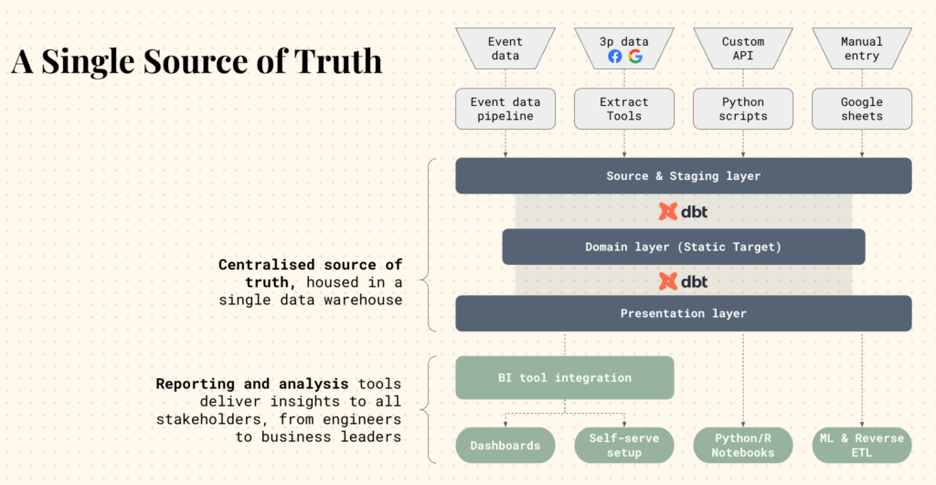
Building a Centralised Analytics Stack
Modern tools make SSOTs much easier to build than before. A typical architecture uses a cloud data warehouse (Snowflake, Databricks or similar) to ingest all raw sources, and a data transformation layer (dbt, Airflow) to clean and model the data.
Key tools include:
- Cloud Warehouse (e.g. Snowflake): provides one shared repository so all teams query the same data . In practice, moving data into Snowflake has let companies retire costly lakes and fragmented stores, reducing complexity.
- Transformation / Semantic Layer (dbt): dbt lets analytics engineers define tables and business logic in code. Critically, dbt’s Semantic Layer allows you to “define metrics once and use them everywhere”, ensuring consistency between dashboards, spreadsheets and even machine learning models. Data leaders note that after dbt, “if I run a report and you run a report, we get the same metric” . Centralised models also enable lineage tracking and freshness testing, so issues are caught in staging before they hit reports.
- Business Intelligence / Dashboarding (Omni, Looker, etc.): Tools like Looker and Omni connect directly to the warehouse and import the shared model. They enforce consistent joins and calculations and embed the semantic definitions. For example, Pendo chose Looker for its integration with Google Cloud and its ability to deliver “a single source of truth and consistent metrics” company-wide . Modern BI platforms support self-service analytics on top of this one model, letting non-technical users explore data without rewriting SQL.
Partner Spotlight: How Tasman Can Help
Building an SSOT is non-trivial – it requires both the right tools and the right strategy. Tasman specialises in guiding startups and enterprises through this transformation. Our data consultants work with you to identify the business-critical metrics, design a governance framework, and implement it using tools like Snowflake (for unified storage), dbt (for clean, documented models), and modern BI platforms (Looker, Omni, etc.). We streamline migrations from legacy dashboards and set up processes so that new KPIs can be added systematically. In practice, following these best practices reduces one-off requests and aligns leadership around clear KPIs – in the words of experts, dashboards should “simplify, not complicate” decisions. By partnering with Tasman, companies tap into proven methods that deliver faster insights, reliable data, and a fully audited analytics pipeline. The result: an end to data fights and time wasted, replaced by confidence that every report reflects the truth (and more time to act on it).
Key Takeaways
Dashboard sprawl creates invisible drag on growth – outdated or duplicated dashboards confuse teams and waste hours. By consolidating data into a single source of truth (using a modern stack like Snowflake + dbt + Omni), organisations align on one version of each KPI. Real-world successes (Pendo, BuzzFeed, ASAPP, etc.) show that moving to a shared data model yields faster decision-making, better self-service, and dramatically improved trust in analytics. Companies that invest in centralising analytics – with expert guidance from teams like Tasman – end the blame-game over numbers and unlock the full value of their data.
Dashboard sprawl creates invisible drag on growth – outdated or duplicated dashboards confuse teams and waste hours. By consolidating data into a single source of truth (using a modern stack like Snowflake + dbt + Omni), organisations align on one version of each KPI.
Real-world successes (Pendo, BuzzFeed, ASAPP, etc.) show that moving to a shared data model yields faster decision-making, better self-service, and dramatically improved trust in analytics.
Companies that invest in centralizing analytics – with expert guidance from teams like Tasman – end the blame-game over numbers and unlock the full value of their data.